Are you ready to unlock the full potential of your data? Combination charts provide an innovative approach to visualizing multidimensional data, enabling you to tell compelling data stories that resonate with your audience. By merging the strengths of different chart types, such as a line chart and a bar chart, you can present diverse datasets in a single visualization, revealing insights that might otherwise go unnoticed.
Imagine measuring projected sales versus actual sales or visualizing the performance of your sales team in a compact yet informative format. With visualization strategies like combination charts, you can effortlessly compare different variables and uncover trends, making comprehensive data insights easily accessible. In this article, you will discover how to effectively use combination charts to enhance your data storytelling, allowing you to engage your viewers and facilitate important discussions. Let’s dive deeper into this powerful analytical tool!
Understanding the Power of Combination Charts
Combination charts stand out in the realm of data visualization as they merge various chart types into a single compelling representation of complex data. They allow you to showcase different aspects of data simultaneously, helping to derive meaningful insights and appreciate multiple perspectives.
What are Combination Charts?
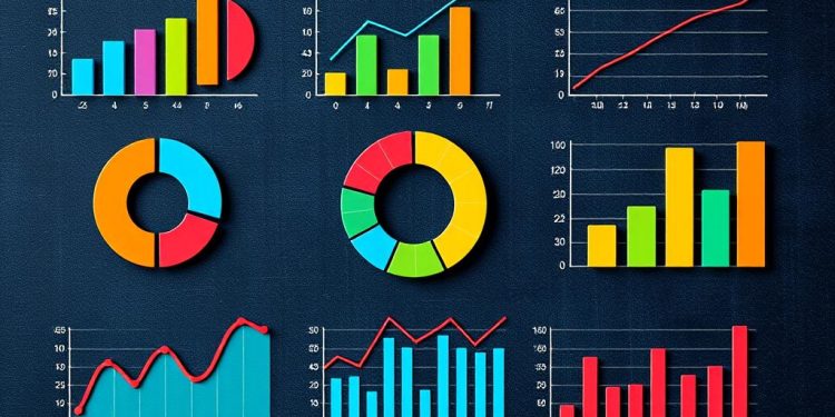
Combination charts integrate two or more chart types, typically a column chart and a line chart, within a single visualization. This type of chart displays data that might otherwise be difficult to interpret in isolation. For example, in Power BI, you can create a combo chart to illustrate both sales in dollars and profit margins in percentages, enhancing your overall understanding of performance metrics.
Benefits of Using Combination Charts for Data Visualization
The benefits of using combination charts extend far beyond mere aesthetics. They provide clarity for multidimensional datasets, allowing viewers to grasp relationships easily. Here are some key advantages:
- Clarity: Present multiple measures with varying scales effectively.
- Space-saving: Combine different metrics into one visualization, conserving report canvas space.
- Enhanced insights: Observe correlations and trends between data sets, facilitating informed decision-making.
- Comparison: Compare performance against targets defined by another measure seamlessly.
- Customization: Tailor axis formats, titles, and scales for improved readability and interpretation.
By implementing combination charts correctly, you facilitate better storytelling through data visualization. These charts serve as valuable tools that assist in navigating complex analytics, making them indispensable for anyone involved in data reporting and strategy.
Choosing the Right Chart Types for Your Data
When visualizing data, selecting the appropriate chart type is essential to convey information accurately. Line charts, bar charts, and scatter plots each serve unique purposes in representing your data effectively. Understanding the strengths of each type can significantly enhance your ability to communicate insights and trends.
Line Charts for Trends Over Time
Line charts excel at illustrating trends over time, making them perfect for time-series analysis. You can efficiently track changes in measures across different periods, showcasing how values fluctuate. This format allows viewers to identify patterns and trends in data, enabling meaningful discussions about progress and performance.
Bar Charts for Comparing Categories
Bar charts are ideal for comparing datasets across distinct categories. They effectively display relative sizes or values, making it easy to discern differences between various groups. For instance, if you aim to highlight sales performance across regions, a bar chart can clearly depict which areas excel and which may need improvement.
Scatter Plots for Metrics Correlation
Scatter plots provide a powerful visualization for examining correlations between two metrics. This chart type allows you to discern relationships, such as classroom size and graduation rates, or lung capacity and endurance. These visual representations of data help in understanding the strength of underlying relationships, which is crucial in various analytical scenarios.
Creating Effective Combination Charts
Creating combination charts offers a powerful way to present multidimensional data. By following a structured approach, you can optimize your visualizations for effective data visualization. Start with the steps outlined below to ensure accuracy and clarity in your charts.
Steps to Create a Combination Chart
To embark on creating combination charts, consider these essential steps:
- Connect to the appropriate data source.
- Drag relevant data fields into the chart configuration.
- Decide on the types of charts you want to incorporate, such as combining line and bar graphs.
- Synchronize y-axes when working with variables that share similar scales to enhance clarity.
- Utilize the filtering options available to streamline your data visibility.
- Customize the appearance by modifying label configurations, background, and color settings for a visually appealing output.
Common Mistakes to Avoid When Combining Charts
While creating combination charts can be advantageous, common mistakes may hinder their effectiveness. Awareness of these pitfalls will help you achieve better results:
- Overcrowding the chart with too many data points can dilute the message.
- Using incompatible scales among different chart types may lead to misinterpretation of the data.
- Neglecting to synchronize axes can result in an unclear presentation of related metrics.
- Failing to aggregate data beyond the maximum limit of 25,000 data points will lead to incomplete charts.
- Ignoring the opportunity to customize elements, such as colors and legends, diminishes the chart’s readability.
By steering clear of these common mistakes, you can ensure your combination charts provide impactful and effective data visualization.
Implementation of Combined Axes in Your Charts
Effective data visualization requires a thoughtful approach to presenting multiple datasets. By implementing combined axes in your charts, you can create a more comprehensive view of complex information. This technique helps in comparing different measures seamlessly while maintaining clarity for the viewer.
Synchronizing Axes for Clarity
When utilizing dual-axis charts, synchronizing the axes is crucial for clarity. Dual-axis combination charts typically use one shared X-axis along with two separate Y-axes for distinct datasets. For instance, you might compare Sales and Discount by Year and Product Category. To achieve effective synchronization, ensure that both axes scale appropriately, allowing the viewer to draw accurate conclusions. This process enhances insight, making it easier to notice trends and relationships between metrics.
Using Dual and Multi-Axis Charts for Enhanced Insight
Dual and multi-axis charts facilitate the visualization of complex interactions among various metrics. When designing these charts, focus on using the correct mark types for each measure. The dual-axis chart in Tableau can be generated by dragging a measure onto the opposite axis, guided by a dashed line for precision. Each measure receives its own Marks Shelf, enabling tailored editing for diverse visualization styles. For example, switching a Profit Ratio from a bar mark to a line mark can reveal multi-dimensional insights effectively.
The following table summarizes key features of dual and multi-axis charts:
| Feature | Dual-Axis Charts | Multi-Axis Charts |
|---|---|---|
| Definition | Chart with one shared X-axis and two Y-axes. | Chart with multiple Y-axes, each representing a different measure. |
| Best Use Case | Comparing two related datasets, e.g., Sales vs. Discounts. | Visualizing several metrics with distinct scales, e.g., Sales, Profit Ratio, and Customer Satisfaction. |
| Insights | Enhances comparison between two metrics. | Provides a comprehensive view of multi-dimensional relationships. |
| Complexity | Lower complexity; easier to interpret trends. | Higher complexity; requires careful scaling and axis synchronization. |
Combining these techniques allows for an engaging visualization experience. Keep in mind the importance of thoughtful implementation to avoid misinterpretation caused by confusing scales.
Using Colors and Legends to Enhance Combination Charts
Colors and legends significantly contribute to the effectiveness of combination charts. Choosing the right color schemes creates contrast and visually emphasizes specific data points, making the charts more understandable. In today’s data visualization landscape, many prominent sources like the Financial Times and the New York Times have adopted innovative approaches such as colorizing text within chart titles, eliminating the need for traditional legends. This trend underscores the importance of effective color schemes in maintaining clarity and enhancing viewer interpretation.
Choosing the Right Color Schemes
Utilizing effective color schemes can greatly affect how easily your audience interprets the data. Consistency in colors across different visualizations helps reinforce understanding. Tools like Flourish incorporate features such as the “Riley legend,” which embeds colors directly into titles, further simplifying data presentation. This approach supports interpretative simplicity while avoiding the clutter that can arise from excess colors. For complex datasets requiring numerical color scales, traditional legends are still highly recommended to clearly delineate shades and their corresponding values.
Establishing Clear Legends for Easy Interpretation
Legends play a crucial role in improving readability and aiding viewers in understanding the meanings behind color variations. In cases where multiple metrics are represented, effective legends become essential. For example, a dual-metric chart employing dark blue for Start of Period (SOP) Headcount and light blue for End of Period (EOP) Headcount allows for immediate visual correlation. When displaying a single metric like EOP Headcount over time, however, legends can be omitted to prevent redundancy, as the metric’s color will remain consistent. This attention to clarity ensures that viewers can easily navigate through your data without confusion.
Conclusion
In summary, combination charts play a crucial role in analyzing multidimensional data, enabling you to uncover valuable data insights effectively. By integrating various chart types into a cohesive visualization strategy, you can present complex information in a more digestible format. This approach allows your audience to grasp patterns, trends, and variations, fostering a greater understanding of the subject matter.
As we’ve explored, successful utilization of combination charts involves selecting the appropriate chart types, aligning axes for clarity, and choosing color schemes that enhance interpretation. By adopting these strategies, you are significantly improving your data storytelling capabilities. This will ultimately help you elevate your overall visualization methodologies, making complex data more accessible and engaging for your viewers.
In conclusion, utilizing combination charts is not just about displaying data; it’s about effectively summarizing findings in a way that resonates with your audience. Embracing this powerful tool allows you to convey meaningful insights while maintaining clarity and engagement in data presentations.


