The landscape of data presentation is evolving rapidly, driven by the integration of 3D and immersive charts. These innovative design tools are not just enhancing visuals; they are fundamentally altering how you communicate complex information. Utilizing augmented and virtual reality, you can create engaging, interactive experiences that resonate with your audience in remarkable ways.
With traditional 2D graphs often falling short in conveying intricate datasets, the shift towards advanced charts allows for multiple layers of information to be represented clearly. Imagine being able to explore vast amounts of data—much like zooming in on Google Earth—while engaging multiple learning styles. This approach fosters a form of audience engagement that is not only memorable but also impactful.
As digital transformation continues across industries, embracing 3D and immersive charts becomes increasingly vital in your strategy. These tools not only facilitate better storytelling but also enhance clarity and understanding in data analysis. The profound impact of utilizing immersive visuals opens the door for new possibilities in how insights are shared and understood.
Introduction to 3D and Immersive Charts
The rise of 3D visuals and immersive data is revolutionizing how information is presented and understood. With tools such as AfterNow Viz, you can utilize augmented reality and virtual reality to bring data to life in ways never seen before. This shift enables complex datasets to be transformed into accessible and engaging formats, which significantly enhances the viewer’s experience and comprehension.
The Role of Augmented and Virtual Reality
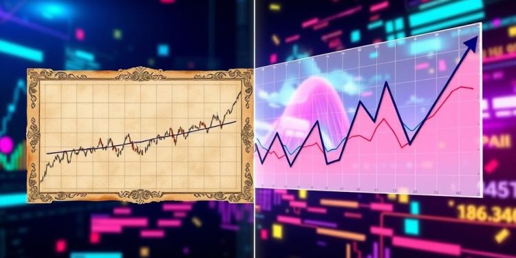
Augmented reality (AR) and virtual reality (VR) play pivotal roles in shaping modern data visualization strategies. Unlike traditional methods that rely on static 2D representations, AR and VR create interactive experiences. This capability allows users to manipulate 3D charts, providing a deeper understanding of relationships and trends within the data.
The transition from 2D to 3D offers considerable advantages across various sectors. For instance, 3D financial projections make it easier to visualize long-term investments, potentially influencing significant client decisions. The user-friendly interface of tools like AfterNow Viz facilitates seamless data integration, emulating popular platforms such as Google Docs, thus promoting wider adoption.
Moreover, immersive environments foster collaboration; multiple users can explore the same datasets in real-time, leading to richer insights and more innovative solutions. A survey revealed that 68% of organizations employing VR reported enhanced decision-making abilities due to improved data immersion. In healthcare, AR applications have demonstrated a 45% increase in patient engagement when visualizing real-time data during consultations.
Furthermore, the ability to import data in CSV format streamlines the creation of 3D visualizations, thereby improving operational efficiency across various industries. By illustrating campaign impacts using spatially aware formats, organizations gain clarity on progress and key milestones.
The emotional engagement facilitated by AR and VR can make data presentations significantly more impactful. Clients have successfully closed billion-dollar deals using such immersive data communication methods, underscoring their financial significance. Educational institutions adopting AR have witnessed a 30% increase in student engagement through dynamic learning experiences, indicating the benefits of incorporating these technologies into both academic and corporate settings.
This innovative approach to data presentation enhances user retention and understanding, ensuring that audiences not only consume information but interact with it meaningfully. As the landscape of data visualization continues to evolve, the integration of immersive technologies is set to transform how we perceive and utilize data across various domains.
The Evolution of Data Visualization Technologies
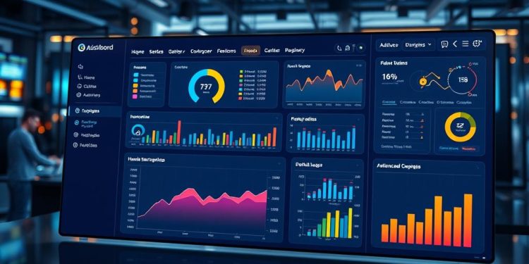
The journey of data visualization began with essential graphics like bar and pie charts, providing a foundation that has grown more sophisticated over time. Modern data visualization technologies embrace interactive dashboards and advanced charts, enabling users to interact with complex datasets seamlessly. In 2024, it is anticipated that 73% of organizations will leverage AI-enhanced data visualizations, improving decision-making across various industries.
As software continues to evolve, tools powered by JavaScript and Python allow for enhanced interactivity within these dashboards. This has revolutionized the way data storytelling unfolds, allowing businesses to convey narratives through visual means rather than traditional text-heavy reports. A survey highlighted that 65% of marketing teams now utilize data storytelling techniques, showcasing the shift toward engaging audiences more effectively.
The transition to 3D models reflects a deeper focus on creating immersive user experiences. Static content now gives way to dynamic visualizations, revealing complex relationships within the data set. Recent statistics indicate that nearly 65% of organizations actively implement immersive technologies, such as 3D charts and augmented reality, marking a significant step forward in data presentation.
The rise of customizable dashboards has become crucial, with around 60% of e-commerce companies reporting increased effectiveness in tracking consumer behavior patterns. Furthermore, 90% of new data visualization tools are expected to integrate cross-platform data capabilities by 2024, providing a holistic view of crucial information for users. The expansion of real-time data visualizations confirms the essential role that these technologies play, particularly in sectors like finance where 66% of institutions rely on timely data to facilitate informed decisions.
How 3D and Immersive Charts Enhance Audience Engagement
3D and immersive charts significantly enhance audience engagement by fostering emotional connections with the data presented. In interactive environments, you transform passive viewers into active participants, allowing for a more profound understanding of the material. This transformation is essential in today’s data-driven landscape, where capturing attention is critical.
By immersing users in an engaging visual experience, 3D mapping applications, for instance, reveal geographic distribution patterns that simple 2D representations may obscure. Marketers utilize this technology to visualize customer demographics and competitor locations effectively. Enhanced audience engagement becomes apparent when customers interact with virtual showrooms, exploring products from multiple angles, leading to better retention and informed purchasing decisions.
Research indicates that data visualized in three dimensions can boost audience engagement by up to 50%. Additionally, utilizing 3D charts can improve information retention rates by approximately 30%, making the insights more memorable. The emotional recall associated with impactful visuals enhances the storytelling aspect inherent in data presentations.
Businesses adopting 3D graphics in their marketing strategies report increased brand preference and recall. These charts allow for in-depth analysis through styles like the 3D Back-to-Back Column, which provides clarity in side-by-side comparisons. A table summarizing significant insights gained from using 3D visualizations follows:
| Benefit | Impact on Audience Engagement |
|---|---|
| Increased Retention Rates | 30% improvement during presentations |
| Improved Decision-Making | Reveals patterns not visible in 2D |
| Higher Satisfaction Levels | 80% of users prefer 3D over standard charts |
| Time Efficiency | 40% reduction in data interpretation time |
| Stronger Emotional Connections | Enhanced storytelling through immersive experience |
Ultimately, the integration of 3D and immersive charts not only makes data more engaging but also aids in unveiling crucial insights, ensuring that you, as a presenter, can capture the audience’s attention and elevate their experience.
Key Benefits of Using 3D and Immersive Charts
3D and immersive charts offer significant key benefits that positively impact how you visualize and understand complex data. These innovative designs create a more engaging visual experience, leading to enhanced understanding among users. By introducing depth and spatial awareness, these advanced visualizations facilitate clearer insights into intricate trends and relationships that traditional 2D formats often miss.
One of the most notable advantages is the improvement in collaboration. Teams scattered across different locations utilize 3D visualization to better grasp project dynamics, thus accelerating development cycles. Studies indicate that organizations using these tools experience up to a 30% increase in creative output. They enjoy the freedom to experiment within a virtual workspace.
Immersive experiences also focus on retention during presentations. Users retain up to 70% of information when interacting with 3D models, in stark contrast to just 10% from static images and text. Implementing “what-if” simulations facilitates faster decision-making, reducing time by as much as 50%. Stakeholders benefit from examining different perspectives that 3D visualization provides before finalizing their choices.
Cost efficiency is another critical element, as companies can reduce the average cost of physical prototypes by up to 40% through digital iterations. The rapid prototyping capabilities of 3D technology increase iteration speed by 60-80%, streamlining the development process. Effective documentation practices in 3D can shorten project documentation phases by 25% due to improved clarity and interactivity.
The ability to quickly refine concepts through 3D visualization saves time significantly; average concept refinement duration decreases by 75%. Companies adopting these technologies report a realization of competitive advantages within just 6-12 months post-implementation. As data volumes continue to grow, the visualization capabilities provided by 3D and immersive charts become essential for efficiently processing and analyzing large datasets.
| Key Benefits | Impact |
|---|---|
| Improved Collaboration | Helps dispersed teams understand project dynamics better |
| Increased Creative Output | Generates 25-30% more creativity in new designs |
| Enhanced Information Retention | Boosts retention to 70% during interactive engagement |
| Faster Decision-Making | Reduces decision-making time by 30-50% |
| Cost Efficiency | Decreases physical prototype costs by up to 40% |
| Increased Iteration Speed | Accelerates iteration speeds by 60-80% |
| Shortened Documentation Phases | Reduces documentation time by 25% |
| Quick Concept Refinement | Reduces concept refinement time by 75% |
Ultimately, 3D and immersive charts not only enhance the overall data visualization experience but also transform the way you interact with and understand data, making complex information more accessible and actionable.
Practical Applications of 3D Visuals in Various Industries
3D visuals have found practical applications across diverse industries such as healthcare, manufacturing, finance, and education. In healthcare, the integration of augmented data visualization allows real-time patient data to be visualized in three dimensions. Physicians can see vital statistics and treatment plans clearly, enhancing patient engagement and understanding significantly.
In the manufacturing sector, teams leverage augmented reality (AR) to overlay schematics directly onto machinery. This innovation facilitates real-time diagnostics and maintenance, significantly boosting operational efficiency and reducing errors during critical operations. Industry examples show that organizations utilizing AR in their workflow have closed multi-billion dollar deals, underscoring the powerful impact of these immersive charts on business outcomes.
Finance professionals benefit from immersive charts that vividly illustrate market trends and forecasts, aiding investment decision-making processes. These visualizations allow analysts to grasp complex data swiftly, a stark contrast to prior methods that required extensive computational resources and time.
Educational settings embrace 3D models to transform complex subjects into interactive learning experiences. Such immersive data exploration fosters deeper retention and comprehension among students, making learning engaging and effective. By incorporating gamification elements, educational applications stimulate active participation, allowing users to navigate complex datasets dynamically.
As these technologies continue to evolve, the versatility of 3D visuals will likely bridge gaps across multiple sectors. The ongoing demand for immersive user experiences highlights a significant shift in communication strategies, confirming that audiences today favor multidimensional narratives. A well-executed 3D visualization can be profoundly engaging and considerably more informative than traditional 2D presentations, elevating the quality of data interpretation.
Challenges and Considerations in Using 3D and Immersive Charts
While 3D and immersive charts can significantly enhance data presentation, a variety of challenges and considerations come into play. One major challenge is the potential for overcomplication of visualizations, which may lead to confusion among audiences rather than promoting effective visualization of data. Careful design is essential; each additional dimension must provide meaningful insight without obstructing understanding.
Adjusting perspective and viewpoint in 3D visualization plays a critical role. Neglecting these factors can result in misinterpretation of data, diminishing the clarity that immersive charts aim to achieve. You must keep usability at the forefront, ensuring that every choice enhances user experience.
Accessibility remains another vital consideration. Immersive experiences should be inclusive for all users, promoting a better understanding of data. Continuous user testing and collecting feedback will be indispensable for refining these visualizations to effectively meet diverse audience needs.
Addressing these challenges stands as a priority for those aiming to leverage the full potential of 3D and immersive charts in their presentations.
Conclusion
The impact of 3D and immersive charts on data presentation strategies is significant and continues to evolve as technology advances. By engaging audiences with dynamic visualizations, you can elevate your ability to tell compelling data stories. As these tools become increasingly integrated into everyday analytics, understanding the core technologies that drive them is essential for achieving success in your presentations.
As we look towards the future of data visualization, the combination of creativity and advanced 3D techniques will allow for richer, more meaningful connections with data. These engaging presentations are not only about aesthetics; they empower informed decision-making and facilitate a deeper understanding of intricate datasets. Utilizing tools like Charts 3D or exploring the capabilities of Three.js can enhance your analysis experience and strengthen your presentations.
Ultimately, embracing the technology evolution in data visualization will transform how individuals and organizations interact with data. In a world where data complexity grows, the ability to visualize in three dimensions will become a crucial asset, redefining how data can serve your business needs and community goals alike.


