
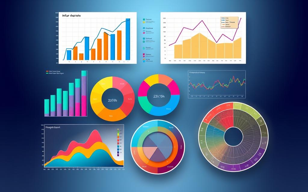
In today’s data-driven world, effectively representing complex datasets is crucial for businesses looking to leverage insights and enhance decision-making processes. Data visualization plays a vital role in this, as it enables you to communicate intricate relationships, trends, and patterns in an accessible manner. To achieve this, selecting the right chart types for complex data is essential. You can create compelling narratives using visualizations such as Sankey diagrams, radar charts, treemaps, and network graphs, ensuring that your audience not only understands the data but engages with it as well.
Efficient data representation not only facilitates clear communication but also fosters competitive advantages by providing stakeholders with the insights they need. By mastering various chart types, you can construct a seamless data story that captures attention and enhances comprehension. The journey begins with understanding how to choose and implement effective visual tools.
Understanding Data Visualization
Data visualization serves as a critical tool in today’s world, enabling clearer insights into complex datasets. By transforming raw information into visual formats, you gain the ability to identify patterns and trends effortlessly. Understanding this process enhances your capability to convey significant messages derived from data.
What is Data Visualization?
Data visualization refers to the graphical representation of data, making it easier to interpret vast amounts of information. By using various visual elements such as charts, graphs, and maps, data becomes more accessible. This method allows you to represent patterns and trends, facilitating immediate recognition of relationships and outliers within the dataset. For instance, implementing a Pareto chart can help showcase how 20 percent of causes lead to 80 percent of problems, illustrating the importance of focusing on crucial factors.
Importance of Effective Data Representation
Effective data representation plays a vital role in analytics by making intricate datasets more comprehensible. Visualizations foster better communication among teams, ensuring that stakeholders grasp essential insights. For example, using heatmaps can reveal underlying trends through color coding, enhancing your understanding of data values. By emphasizing clarity, you improve the likelihood of informed decisions that positively influence business outcomes. When individuals comprehend patterns and trends within their data, the potential for insightful decision-making increases significantly.
| Visualization Type | Best Use Cases | Key Features |
|---|---|---|
| Sankey Diagram | Visualizing resource distribution | Demonstrates flows between components |
| Heatmap | Identifying trends across two dimensions | Utilizes color intensity for representation |
| Radar Chart | Comparing multiple variables | Engaging format; shows diverse data points |
| Column Chart | Comparing quantities across categories | Length correlates directly to value |
| Bubble Chart | Visualizing relationship between multiple variables | Represents three or four data dimensions |
Chart Types for Complex Data
When you deal with complex data, the selection of chart types becomes essential for effective representation. Different visualizations serve various purposes, fulfilling specific analytical needs. Each chart type possesses unique advantages that enable you to interpret and convey your data in engaging ways.
Sankey Diagrams: Visualizing Flows
Sankey diagrams showcase the flow and transfer of data between variables. They are particularly effective for illustrating how resources, information, or energy move through systems. The width of the lines reflects the magnitude of flow, making it easy to grasp relationships and trends over time.
Radar Charts: Comparing Multidimensional Data
Radar charts excel in the comparison of multiple variables within a single visualization. By plotting various dimensions on a circular grid, you gain immediate insights into how data points interact. These charts are invaluable for assessing performance across different criteria, which enhances your understanding of multidimensional datasets.
Treemaps: Displaying Hierarchical Data
Treemaps provide a visual representation of hierarchical data through nested rectangles. Each rectangle’s size reflects a category’s proportion compared to others, allowing you to uncover relationships and patterns within complex datasets. This visualization effectively highlights the contribution of each element to the whole.
Network Graphs: Understanding Connections
Network graphs illustrate relationships among various entities, making them ideal for deciphering intricate networks. Nodes represent entities while edges signify connections. This visualization method reveals underlying patterns and structures within your data, facilitating a deeper understanding of how different components interact.
Best Practices for Choosing Chart Types
Selecting the appropriate chart type is crucial for effective data visualization. Understanding your data’s structure and your audience’s needs is vital in achieving clarity and engagement. When assessing data structure, consider the relationships, quantities, and categories inherent in your data. This evaluation can help determine whether to use simpler chart types like bar charts or more complex visualizations such as Sankey diagrams or treemaps.
Assessing Your Data’s Structure
Begin by analyzing the type of data you possess. Identify whether your data is categorical, numerical, or time-series. Understanding the essence of your data assists in implementing the best practices for choosing chart types. For instance, bar and column charts are favored for comparing values across different categories. Alternatively, line charts and area charts work well for illustrating changes over time, effectively showcasing trends such as a company’s sales figures.
Identifying Your Audience’s Needs
Knowing the audience you cater to is equally important. Tailor visualizations to meet their comprehension preferences. Simple, clear representations generally resonate better with stakeholders than intricate designs. This principle reinforces the idea that the best practices for choosing chart types must account for audience needs. Providing clear representations supports effective decision-making and enhances understanding of critical insights.
Examples of Effective Chart Types for Complex Data
Understanding the right chart types can significantly enhance your ability to analyze complex data sets. Various visualizations like heatmaps and bubble charts provide insightful ways to represent intricate relationships. Below are a couple of exemplary chart types, showcasing their effectiveness in handling complex data.
Case Study: Using Heatmaps for Correlation Analysis
Heatmaps function as a powerful tool for performing correlation analysis. By utilizing a grid format with color gradients, heatmaps represent variations in numerical data through color intensity. This graphical representation makes it easy to spot patterns and trends across large datasets. For instance, marketers can analyze user engagement by examining the intensity of interactions across different channels, effectively identifying which areas yield the highest engagement levels.
Application: Utilizing Bubble Charts for Multivariate Data
Bubble charts excel in visualizing multivariate data by representing three dimensions of information. Each bubble’s position reflects its correlation, while the size and color can indicate additional variables or categories. This type of visualization proves advantageous when showcasing complex comparisons, such as analyzing customer behavior based on various factors like age, purchase frequency, and preferences. It delivers a comprehensive overview that facilitates insightful decision-making.
Conclusion
In summary, your choice of chart types greatly influences the effectiveness of complex data visualization. Understanding the characteristics of various charts, like Sankey diagrams, radar charts, treemaps, and network graphs, provides insights into how these tools can enhance your data representation. Each chart type has its strengths and optimal contexts for use, allowing you to convey intricate data insights in a manner that resonates with your audience.
Applying best practices in your visualizations not only fosters clarity but also aids in better decision-making within your organization. As you explore different chart types, remember that embracing these visualization strategies will maximize the impact of your findings. With tools ranging from line charts to scatter plots, and even heatmaps to illustrate density effectively, you can elevate your expertise in representing complex datasets.
Ultimately, the conclusion on chart types highlights the necessity of choosing wisely to enable effective data storytelling. Whether you are presenting numerical trends or hierarchical structures, mastering the art of data visualization will undoubtedly enhance your overall communication, making your complex data accessible and actionable.


