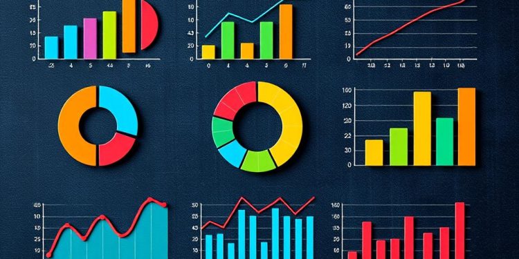
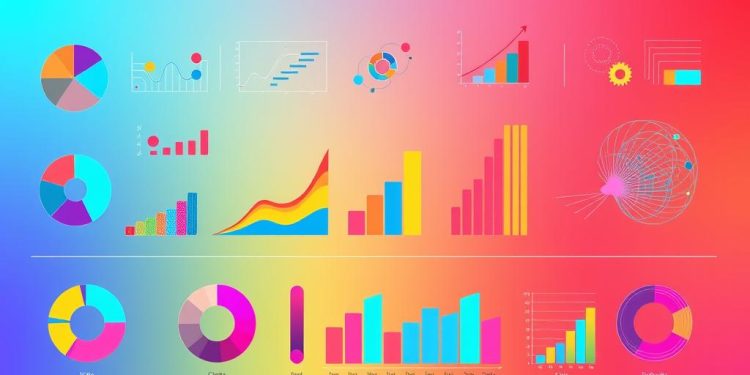
In today’s data-driven world, mastering advanced chart types is essential for effective data presentation. These innovative visual tools allow you to transform complex datasets into captivating narratives that engage your audience and enhance your decision-making processes. This article will guide you through various advanced chart types, highlighting their applications in data storytelling. By employing these techniques, you unlock the full potential of your data storytelling abilities, ensuring your insights are both memorable and impactful.
Understanding the Essence of Data Storytelling
Data storytelling plays a crucial role in modern communication, merging data visualizations with narrative techniques to deliver compelling messages. By leveraging effective communication techniques, your data can engage audiences on a deeper level, transforming numbers and charts into stories that resonate.
Defining Data Storytelling
At its core, data storytelling combines the analytical strengths of data with the emotional aspects of storytelling. This approach helps illuminate key insights and makes complex information more accessible. In today’s fast-paced environment, understanding how to articulate data through narratives is increasingly valuable, as evidenced by a growing demand for research analysts—predicted to rise by 25 percent between 2020 and 2030. Additionally, numerous companies now list data storytelling as a crucial skill in analyst job descriptions.
Importance of Visualizations in Communication
Visualizations serve as the backbone of effective data storytelling, enabling you to highlight patterns and trends that might remain hidden in raw data. A Harvard Business Review survey revealed that 87% of respondents believe organizations could improve efficiency by empowering front-line workers with data. The strategic use of interactive dashboards, heat maps, and other advanced data visualization tools can streamline decision-making processes. With the rise of environmentally conscious consumers, visualizations play an essential role in demonstrating sustainable practices, which could drive revenue growth for companies.
What is Data Visualization?
Data visualization involves the graphical representation of data, making complex information more accessible and easier to interpret. By utilizing various graphic representations, you can effectively convey data insights that are often difficult to grasp through raw numbers alone. With over eighty types of charts and graphs available, it becomes essential to select the appropriate visualizations based on the data’s context.
Graphic Representations of Data
Different graphic representations serve unique purposes and contexts. For example, bar charts and pie charts frequently illustrate part-to-whole relationships, while heatmaps can visualize data distribution across categories. Each chart type falls into one of six use cases: Comparisons, Correlations, Part-to-whole & Hierarchical, Data over Time, Distribution, and Geospatial & Other, ensuring that data visualization meets specific analytical needs.
How Visualization Enhances Understanding
Effective data visualization can significantly enhance understanding of complex information. Studies indicate that 92% of people believe visualizations improve comprehension over traditional reports. Furthermore, the general public can interpret standard visual formats, like bar charts, without deep expertise. Consequently, a well-chosen data visualization serves not just to present information but also to clarify and highlight key insights.
Advanced Chart Types for Data Storytelling
In the fast-paced world of data analytics, using advanced chart types can significantly enhance the effectiveness of your data storytelling techniques. These visual tools not only present information clearly but also allow for deeper data insights. Understanding various advanced chart types can lead you to make informed decisions, bridging the gap between raw data and meaningful narratives.
Overview of Advanced Chart Types
Advanced chart types include a variety of options such as:
- Line charts
- Bar charts
- Scatter plots
- Pie charts
- Column charts
- Treemap charts
- Heatmap charts
- Pareto charts
- Geo charts
- Waterfall charts
- Donut charts
- Funnel charts
- Bubble charts
- Histogram
- Candlestick charts
- Area charts
- KPI charts
- Scatter maps
- Sankey charts
- Radar charts
Each of these chart types serves a distinct purpose in delivering data insights. For example, dual-axis charts enhance comparisons by layering two measures over a common timeline. Butterfly charts facilitate demographic comparisons by placing two datasets side by side, while heatmaps can establish relationships between variables across a grid.
Benefits of Using Advanced Charts
Employing advanced chart types comes with numerous benefits that can enhance your data storytelling. Here are some key advantages:
- Improved Clarity: Advanced charts, such as donut charts, can transform traditional pie charts into clearer formats with a hollow center for better comprehension.
- Enhanced Comparisons: Dual-axis charts allow you to display different variables effectively, showcasing nuanced relationships.
- Dynamic Insights: Utilizing interactive elements like filters and parameters in advanced dashboards can lead to more engaging data exploration.
- Clearer Narratives: Stacked bar graphs visually represent multiple groups within one bar, helping in analyzing dimensions like sales performance.
- Efficient Data Flow Visualization: Waterfall charts effectively show the progression of data through both positive and negative values, making trends more understandable.
Using these advanced chart types, you can ensure your data storytelling techniques not only resonate with but also empower stakeholders to take actionable steps based on clear, compelling visual narratives. Each chart type has its unique strengths, which, when utilized properly, lead to impactful data insights that drive decision-making.
| Chart Type | Best Use | Unique Feature |
|---|---|---|
| Dual Axis Charts | Comparing two measures | Layers on common timeline |
| Butterfly Charts | Comparing two datasets | Side-by-side visuals |
| Heatmaps | Establishing variable relationships | Grid-based analysis |
| Waterfall Charts | Visualizing data flow | Sequences of results |
| Donut Charts | Clarifying category distributions | Hollow center for data focus |
Exploring Radial Charts and Their Applications
Radial charts serve as a unique alternative in the realm of data visualization. They present data in a circular format, allowing for the simultaneous comparison of multiple variables. This format enhances the process of effective storytelling through visual means. Understanding when and how to implement radial charts can significantly elevate your storytelling capabilities, especially when engaging with complex data.
Understanding Radial Charts
Radial charts display data points in a circular manner, making it easier to visualize relationships and trends. They excel in illustrating part-to-whole relationships, effectively managing bulky figures while avoiding clutter. This feature caters to diverse audiences, enabling better comprehension of advanced visualization techniques. For instance, a Radial Bar Chart can facilitate comparisons across several entities, turning intricate numerical data into a more digestible format.
When to Use Radial Charts for Effective Storytelling
Implement radial charts when you wish to showcase relationships among several related datasets. They shine in scenarios where data benefits from a radial display, such as survey results or seasonal variations. This type of chart can elucidate outliers and commonalities, providing clear insights into the data presented. Nevertheless, it is advisable to avoid using radial charts when the number of variables becomes overwhelming, as this can obscure key insights.
| Chart Type | Best For | Advantages |
|---|---|---|
| Radial Charts | Part-to-whole relationships | Easy comprehension of complex data |
| Bar Charts | Comparing categories | Highly recognizable and versatile |
| Line Charts | Tracking trends over time | Effective for continuous data sets |
| Pie Charts | Visualizing proportions | Good for budget allocation insights |
| Scatter Plots | Examining relationships | Useful in scientific research |
Utilizing Heatmaps for Deep Data Insights
Heatmaps serve as powerful visual tools, showcasing data through color coding. With this method, you can quickly identify trends and patterns across complex datasets. Their efficiency shines in areas like retail, manufacturing, and urban planning, where understanding data insights can lead to informed decisions.
The Mechanics of Heatmaps
Heatmaps visually represent volumes of data points, making it easier to discern trends within large datasets. The use of color simplifies the visual representation, where darker shades indicate higher values while lighter shades suggest lower values. For example, in retail environments, heatmaps are instrumental in pinpointing busy store hours and product performance. Specific insights show that Mondays at 10:00 AM often witness peak traffic, while darker colors highlight high sales volumes, aiding inventory management.
In manufacturing scenarios, heatmaps can illustrate which production bays generate the most defects. This visualization aids in quickly identifying issues and streamlining resource allocation. Similarly, urban planners utilize heatmaps to represent population density, where darker shades delineate areas of high population concentration.
Best Practices for Creating Heatmaps
In crafting effective heatmaps, following best practices enhances clarity and impact. Consider the following tips:
- Select intuitive color palettes to convey meaning effectively.
- Utilize white space strategically to avoid overcrowding.
- Choose appropriate datasets, such as weather patterns or sales figures, for actionable data insights.
- Implement clustered heatmaps for comparative analysis, especially valuable in fields like biological sciences.
By adhering to these best practices, you can cultivate heatmaps that not only visualize data effectively but also uncover hidden relationships and trends for deeper insights.
Leveraging Treemaps for Hierarchical Data
Understanding how to effectively visualize hierarchical data can make a significant difference in data interpretation. Treemaps provide an innovative method for displaying this type of data, presenting complex relationships in a visually appealing format. They utilize nested rectangles to represent categories and their subcategories, clarifying the part-to-whole relationships within your datasets.
What are Treemaps?
Treemaps are graphical representations designed to depict hierarchical data using nested rectangles. Each rectangle’s size reflects a specific dimension of the data, allowing you to comprehend not just individual components but also their connection to the overall structure. This approach is particularly effective in situations where various categories contribute to a total, such as financial data or market segmentation.
How Treemaps Improve Data Interpretation
The power of treemaps lies in their ability to enhance your understanding of hierarchical data. They allow you to quickly identify patterns, trends, and anomalies across multiple categories. For example:
- Spotting outliers within large datasets becomes easier.
- Analyzing the distribution of categories aids in strategic decision-making.
- Visualizing the relationship between parent and child categories fosters a clearer comprehension of data structures.
Below is a representation of how treemaps can be used to interpret hierarchical data effectively:
| Category | Subcategory | Value |
|---|---|---|
| Sales | Online | $300,000 |
| Sales | In-Store | $200,000 |
| Marketing | Digital | $150,000 |
| Marketing | Traditional | $100,000 |
By employing treemaps, you can unlock the potential of hierarchical data in a way that promotes insightful data interpretation. Capturing the nuances of your data helps foster better decision-making processes and enhances overall communication. Engaging with treemaps shifts your focus from raw numbers to the relationships they represent, enabling a more holistic view of your datasets.
Innovative Visualization Techniques: Sankey Diagrams and Network Graphs
Data visualization continually evolves, with innovative visualization techniques like Sankey diagrams and network graphs standing out in their effectiveness. These methods help convey complex information in a digestible format, making it easier for viewers to grasp intricate data interdependencies.
Sankey Diagrams: Showing Flow and Distribution
Sankey diagrams are exceptional in illustrating the flow of resources or data between different entities. When analyzing large datasets, these diagrams highlight connections and proportions clearly. You can utilize Sankey diagrams to show how inputs lead to outputs, making it ideal for resource management and distribution studies. This method of visualization enhances understanding of how various elements interact and contribute to the broader picture.
Network Graphs: Visualizing Relationships
Network graphs effectively depict the relationships among various nodes within a dataset. They provide insight into how entities correlate with each other, such as people, organizations, or other objects of study. This visualization technique is excellent for tracing connections and identifying clusters or influential elements within network structures. Utilizing network graphs can greatly enhance storytelling by clearly presenting the dynamics at play between multiple data points.
Both Sankey diagrams and network graphs not only serve as powerful tools for visualizing complex relationships but also contribute to a more comprehensive understanding of data-driven narratives. By incorporating these advanced visualization techniques into your analysis, you can elevate your presentations and improve audience engagement.
| Feature | Sankey Diagrams | Network Graphs |
|---|---|---|
| Use Case | Flow of resources | Relationship between entities |
| Data Representation | Proportional flows | Nodes and connections |
| Complexity Handling | High | Very High |
| Audience Engagement | Yes | Yes |
Conclusion
In your journey of mastering data storytelling, embracing advanced chart types is crucial for creating impactful narratives. These visual tools enhance audience engagement by making complex datasets more digestible. Each chart type, whether it’s a line chart to analyze trends or a scatter plot to unveil relationships, serves a specific purpose in offering clarity and insight.
By applying techniques such as stacked bar charts for performance comparison or funnel charts to illustrate conversion rates, you can effectively communicate your insights. Understanding when to deploy these advanced chart types not only enriches your storytelling experience but also ensures your audience walks away with a better understanding of the data dynamics involved.
Your objective is to allow the data to speak for itself, guiding your audience through a compelling story that fosters informed decision-making. By carefully choosing the right visualizations, you create an environment where every piece of information contributes meaningfully to your narrative, thus enhancing the overall effectiveness of your data storytelling initiative.

