In the landscape of modern business intelligence, interactive dashboards stand out as invaluable tools that can transform raw data into actionable insights. Designed to cater to various organizational needs, such as marketing analysis, sales performance, and customer support metrics, these powerful platforms help you make informed decisions through a clear presentation of data. With dynamic visuals and efficient data processing, effective interactive dashboards make a significant difference. In fact, surveys indicate that 87% of organizations experience enhanced performance after implementing these tools.
Whether you’re part of a B2C, B2B, or a consulting agency, your success hinges on the ability to engage with your data effectively. A substantial 88% of users leverage these platforms for marketing purposes, while 60% utilize them for sales analytics. With the right features, such as real-time updates and customization options, you unlock the potential to supercharge user engagement and streamline your decision-making process.
Understanding Interactive Dashboards and Their Importance
Interactive dashboards serve as a vital component of business intelligence, creating a centralized hub for data analysis and insights. They simplify complex datasets and empower teams by facilitating real-time monitoring and collaboration. The importance of dashboards becomes evident when organizations recognize how much faster and more accurately they can make decisions with immediate access to data. Studies indicate that over 70% of OrderPay’s users regularly explore data to uncover hidden insights. Such high engagement reflects a broader tendency for companies leveraging interactive dashboard solutions.
The Role of Dashboards in Business Intelligence
Interactive dashboards play a significant role in business intelligence by integrating various data sources into a single, user-friendly interface. Users can manipulate data in real-time, enhancing engagement and leading to valuable insights. Companies using these dashboards report a 15-20% improvement in decision-making efficiency compared to those relying on static models. Organizations like Wellthy, which saved over $200,000 after implementing an intuitive analytics solution, demonstrate how effective these tools can be in fostering data accessibility.
Impact of Interactive Dashboards on Decision-Making
The impact of interactive dashboards on decision-making is profound. Facilitation of real-time feedback across teams enhances agility and accelerates operational adjustments. With mobile-friendly options, organizations witness a 25% increase in decision-making capabilities, allowing data access on-the-go. Moreover, companies with self-service BI tools report a 30% reduction in reliance on IT, empowering more employees to engage directly with data. This shift not only accelerates insights but also democratizes data, making it accessible to everyone, regardless of technical ability.
| Statistic | Impact |
|---|---|
| 70% of OrderPay’s users explore data | High engagement with dashboards |
| Over $200,000 in savings by Wellthy | Enhanced data accessibility |
| 30% boost in conversion rate by Northmill | Improved access to real-time KPIs |
| 25% increase in decision-making capabilities | Mobile-friendly dashboard access |
| 60% improvement in sharing insights | Enhanced team collaboration |
Overall, the importance of dashboards extends beyond simple visualization; they are instrumental in shaping informed, data-driven decision-making processes across organizations. With the ever-growing expectation for immediate access to insights, interactive dashboards will continue to evolve as key players in business intelligence initiatives.
Key Features That Enhance User Engagement
User engagement plays a crucial role in the effectiveness of interactive dashboards. The combination of engaging design and practical features can lead to higher user participation and satisfaction. Dynamic visuals and customizable filters significantly contribute to this experience.
Dynamic Visuals for Better Data Interaction
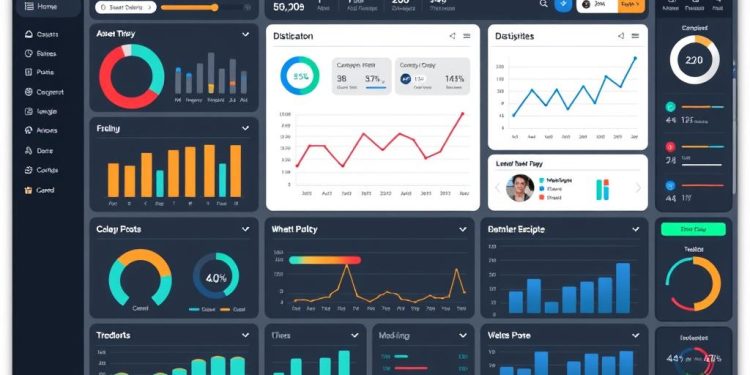
Dynamic visuals like bar charts, line graphs, and geospatial representations facilitate user interaction with the data. Such elements allow you to explore complex datasets in an intuitive manner, improving comprehension and insights. Engaging visuals capture attention, essential in a crowded digital landscape where user attention can wane. By providing context through these visuals, you can preempt questions about performance and foster a better understanding of the data at hand.
Filters that Customize Data Views
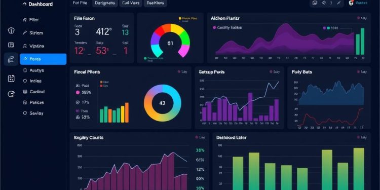
Filters offer the flexibility to tailor data presentations according to individual needs. This customization enhances user engagement by allowing you to focus on specific metrics relevant to your tasks. Personalized dashboards improve user interaction, helping streamline workflows and increasing satisfaction. By allowing users to manipulate what they see, filters turn passive viewers into active participants, enhancing the analytical experience.
Real-time Updates: Keeping Data Fresh
Real-time updates play a vital role in ensuring that interactive dashboards display the latest information relevant to your organization. This feature allows you to monitor and analyze data as it is generated, significantly aiding in timely decision-making. A dashboard that refreshes quickly provides internal stakeholders and external customers with up-to-date insights, thereby improving operational efficiency.
Industries such as healthcare utilize real-time data visualizations to monitor critical aspects like patient vital signs and bed availability. Financial institutions depend on real-time charts to track stock prices and market trends efficiently. In e-commerce, retailers leverage real-time insights during significant sales events like Black Friday, making immediate adjustments to pricing and promotions critical for maximizing sales.
Maintaining data accuracy is essential. Poor data management practices, including inefficient queries and lack of pre-computed aggregations, can lead to latency issues, adversely affecting user experience. For example, when querying large tables without efficient filtering, latency can increase, complicating the decision-making process.
To enhance the performance of real-time dashboards, using rollups to pre-aggregate time series data is advisable. This technique reduces query complexity, as demonstrated by condensing a month of second-by-second temperature readings from approximately 2,592,000 rows down to just 30.
Overall, organizations that embrace real-time updates experience a considerable boost in decision-making speed and accuracy. Research indicates a 60% increase in decision-making speed when utilizing real-time dashboards, along with a reported reduction in data quality issues by 50%. The availability of real-time data not only supports identifying anomalies quickly but also enhances the confidence of decision-makers, ultimately leading to a more effective response to market fluctuations.
| Industry | Applications for Real-time Updates | Benefits |
|---|---|---|
| Healthcare | Monitor patient vital signs | Improved patient care and timely interventions |
| Finance | Track stock prices and market trends | Enhanced investment decision-making |
| E-commerce | Adjust pricing and promotions during sales | Maximized revenue and customer satisfaction |
Customization Options for Personalized Experience
Interactive dashboards offer a robust way to enhance user experiences through thoughtful customization. This capability enables you to tailor dashboards according to specific user needs and preferences, focusing on the metrics and visuals that matter most. A few key elements underlie the essence of effective dashboard design, which plays a critical role in delivering a personalized experience.
Tailoring Dashboards to User Needs
Each user interacts with data differently, making customization options essential. For instance, interactive dashboards can be fully configurable and security-role based, ensuring that each user sees data relevant to their role. With the ability to choose among four layout options for both multistream and single-stream dashboards, you can create a setup that aligns perfectly with your workflow. Visual filters and data streams enhance this personalization further, allowing customer service representatives to get detailed insights without unnecessary distractions.
Importance of Flexible Design in Dashboard Usability
Flexible dashboard design plays a significant role in usability and accessibility. It allows users to configure multiple data streams, providing an unlimited number of options to meet various analytical requirements. Each stream can be customized to filter or sort data in ways that make sense for specific tasks. For instance, a default sort option set on the “Modified On” field helps streamline how data is presented. Additionally, visual filters utilize both the filter entity fields and those from related entities, enabling comprehensive data analysis that informs decision-making.
Accessibility and User-Friendly Dashboard Design
Creating dashboards that prioritize accessibility ensures that all users can effectively navigate and utilize the tool, regardless of their technical skill level or device used. A user-friendly dashboard design is essential for maximizing engagement and fostering a data-driven culture within an organization.
Features such as responsive design allow dashboards to function seamlessly across various devices, maintaining a consistent user experience on both desktops and mobile platforms. This adaptability can reduce bounce rates by upwards of 20%, emphasizing the demand for accessible interfaces.
Utilizing contrasting colors in dashboard design helps to emphasize key performance indicators, potentially enhancing user engagement by up to 30%. A minimalist approach can significantly reduce cognitive load by approximately 40%, making it easier for users to digest complex data. Clear labeling alongside key figures boosts immediate comprehension by about 45%, contributing to a more user-friendly experience.
To visualize data effectively, incorporating interactive elements such as hover details encourages user interaction, increasing rates by around 25%. The strategic use of white space improves readability by approximately 50%, further promoting user-friendliness.
Tables, organized with proper headers, can enhance accessibility ratings of dashboards by up to 40%. Moreover, utilizing various chart types addresses different data analysis needs, resulting in a 50% increase in satisfaction with data presentation. Regular testing for compatibility with assistive technologies can improve user experience ratings by approximately 50%, underscoring its importance.
Balancing aesthetics with accessibility leads to actionable insights and better decision-making processes across industries. Consideration of these aspects in dashboard design not only boosts user adoption rates but also cultivates an inclusive environment where every team member can harness the full potential of data.
| Feature | Impact on User Engagement | Accessibility Benefits |
|---|---|---|
| Responsive Design | Reduces bounce rates by 20% | Enhances usability across devices |
| Contrasting Colors | Increases engagement by 30% | Improves visibility for users |
| Interactive Elements | Boosts interaction by 25% | Supports diverse user interaction modes |
| Minimized Cognitive Load | Reduces cognitive load by 40% | Facilitates easier data comprehension |
| Clear Labeling | Enhances comprehension by 45% | Aids in navigating complex data |
Conclusion
In summary, the effectiveness of interactive dashboards hinges on a strategic combination of features that promote user engagement and streamline data access. By incorporating real-time updates, organizations experience a remarkable increase in both collaboration and adaptability, ultimately leading to better data-driven decisions. The robust functionalities like dynamic visuals, customizable filters, and user-friendly design not only enhance the interactive experience but also empower you to explore your data with minimal obstacles.
Statistics reveal that businesses integrating these effective features can see significant financial benefits, with numerous reports indicating revenue increases as high as 80%. As only a fraction of users fully embrace modern analytics solutions, the success of your interactive dashboards largely depends on providing an enjoyable and intuitive experience. This is key to unlocking the hidden value of your data, estimated to be worth $2.6 trillion when real-time data is effectively utilized.
Investing in effective interactive dashboards is essential for staying competitive in today’s fast-paced landscape. By understanding the importance of user involvement and simplifying the data interaction process, you can cultivate a culture where informed decisions are made seamlessly. So, take the time to optimize your dashboards to harness their potential, reinforcing user autonomy and ensuring your organization is equipped to meet future challenges.


