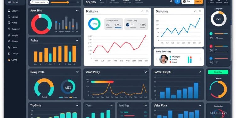
Filters in dashboards play a crucial role in enhancing user interaction and enabling engaging data visualization experiences. By allowing you to customize the view of your data, these filters empower you to explore insights more effectively and interactively. In fact, interactive dashboards have been shown to boost engagement significantly, as they simplify data exploration through features such as drill-down capabilities.
Research indicates that 68% of users report improved understanding of data context when utilizing interactive elements. This functionality not only helps you uncover detailed insights but also facilitates seamless navigation between metrics, leading to a remarkable 45% increase in data reference accuracy. As you engage with your dashboard, the option to drill into specific visualizations grants access to external resources, which enhances the utility of your data and overall experience.
In this article, we will provide you with a comprehensive guide on how to effectively implement filters in dashboards, explore various filtering options, and apply drill-down techniques for deeper insights that drive data segmentation. Get ready to elevate your data analysis skills using these essential visualization tools!
Introduction to Dashboard Filters
Dashboard filters play a vital role in data analysis and visual representation. They empower users to customize their experience by showcasing data segments most relevant to their needs. Understanding the importance of filters helps stakeholders efficiently sift through vast amounts of information, focusing on areas that genuinely matter. Equipped with these tools, you can foster deeper insights and enhance the overall effectiveness of your data strategy.
Understanding the Importance of Filters
The importance of filters extends beyond simple sorting. Filters allow for the creation of dynamic views without duplicating dashboards, enhancing data analysis across multiple dimensions such as time and geography. Users are presented with several filter types including Date Picker, Location, ID, Number, and Text/Category. Each type influences how data is displayed, making it essential for tailored user interaction and audience customization.
How Filters Enhance User Interaction
By facilitating audience customization, filters significantly improve user interaction with dashboards. Users can manipulate these filters to glean insights that align closely with their decision-making processes. For instance, multi-select filters enable the selection of multiple values simultaneously, while linked filters allow for hierarchical data refinement. This interactivity not only raises engagement but also contributes to more meaningful and actionable insights.
| Filter Type | Use Case | Examples |
|---|---|---|
| Date Picker | Selecting specific time periods | Days, Months, Years |
| Location | Narrowing down geographical data | City, State, ZIP/Postal Code, Country |
| Number | Comparative analysis | Equal to, Greater than, Less than |
| Text/Category | Filtering based on string criteria | Contains, Starts with, Ends with |
Creating a Filter Menu for Dashboard Viewers
Setting up a filter menu enhances the experience for dashboard viewers, allowing them to explore data intuitively. With the right setup process, you can ensure viewers have access to filtering options that help them find specific information without needing admin privileges.
Step-by-Step Process to Set Up Filters
To create an effective filter menu, follow these steps:
- Open your dashboard.
- Click the Settings button located in the upper right corner.
- Navigate to the Filters tab.
- Select fields from available data sources to configure your filter options.
- Set default values for filters if desired, enhancing user experience.
- Save your changes to enable the filter menu for viewers.
Completing these steps grants viewers access to the Filters button, empowering them to adjust the data they see based on the parameters defined by you.
Choosing Fields for Filtering Options
Selecting the right fields is crucial in maximizing the utility of your filter menu. Here are key considerations:
- Fields must be relevant to the data presented on the dashboard to ensure accurate filtering.
- Text fields require precise manual entry due to case sensitivity. This emphasizes the need for careful value entry.
- Consider offering both permanent and temporary filtering options to viewers, as they can choose to manipulate filters without affecting other users. Temporary changes do not alter the dashboard for other viewers.
- Advanced filters can leverage fields from outside the controlled Explores, broadening the availability of data selections.
With these insights, you can build a filter menu that not only organizes data efficiently but also enhances the overall functionality of the dashboard.
| Filter Type | Description | Access | Maximum Values |
|---|---|---|---|
| Permanent | Affects all users and requires Manage Access and Edit rights. | Admin access needed | N/A |
| Temporary | Affects only the current viewer’s session. | Viewer access | N/A |
| Multi-select | Allows selection of multiple values. | Viewer access | 30 for buttons, 50 for checkboxes |
| Range Slider | Filters numeric data with adjustable settings. | Viewer access | Customizable min/max |
| Date Range | Filters based on specific time periods. | Viewer access | N/A |
Filters in Dashboards: A Comprehensive Guide
Exploring filters in dashboards reveals a variety of essential functionalities that enhance data analysis. Understanding the different types of filter options available can significantly improve your ability to navigate and visualize data. Additionally, being aware of case sensitivity and how it impacts text values is fundamental to accurate filtering.
Types of Filter Options
Filters in dashboards come in several different types, including:
- Dimension Filters: These filters segment data based on categorical labels, making it easier to isolate specific groups.
- Measure Filters: These restrict data based on numerical values, allowing you to focus on relevant metrics.
- Context Filters: These provide a way to apply filters based on user-defined criteria, ensuring tailored insights.
- Dynamic Quick Filters: These enable real-time adjustments based on user preferences, although editing them changes their function to advanced filters requiring manual updates.
Utilizing these various filter types can lead to better insights and clearer data presentation in your dashboards.
Case Sensitivity and Text Values
When working with text values in your filters, understanding case sensitivity is critical. Text values must match exactly what is recorded in the data source. Misalignments can lead to inaccurate filtering outcomes, which may impact your overall data analysis. For instance, entering “Apple” instead of “apple” will yield different results due to this sensitivity.
Every filter applied will function on an “AND” logic basis with existing report filters, ensuring that only the most relevant information is displayed based on your criteria. This method enhances user interaction and optimizes the data exploration process.
Drill-Down Techniques to Deepen Data Insights
Embracing drill-down techniques transforms how you analyze data, allowing for a more profound understanding of performance metrics. With effective data segmentation, you can identify trends and patterns that are otherwise buried within generalized datasets. This structured approach not only enhances your analysis but also provides clarity and actionable insights.
Identifying Trends Through Data Segmentation
Data segmentation is crucial for recognizing trends across various dimensions. By dissecting your data into specific categories, like sales by product or region, you can pinpoint opportunities or problems effectively. This nuanced perspective enables targeted strategy adjustments, whether you are optimizing marketing campaigns or refining product offerings.
Utilizing Bar Charts for Focused Analysis
Bar charts serve as an excellent tool for focused analysis, visually showcasing your segmented data. For instance, comparing performance across different product lines can highlight significant variances. Applying drill-down techniques to these visualizations allows you to dive deeper, unveiling insights into negative profit areas or other critical metrics.
Incorporating Contextual Filters for Improved Navigation
Contextual filters enhance navigation within dashboards, enabling you to isolate specific variables that impact performance metrics. This setup allows for a more granular exploration of your data, supporting informed decision-making. By combining drill-down techniques with tailored filters, you streamline the process of uncovering details that matter most to your analysis.
Visualization Tools for Effective Data Analysis
The right visualization tools can transform data analysis into an engaging and informative process. Choosing the appropriate visual representation for your data significantly influences how insights are communicated and understood. Various types of charts and graphs serve unique purposes, making it essential to select those that align with your analytical goals.
Choosing the Right Visualization for Your Data
Different datasets require different visualization approaches. For example, bar charts are excellent for comparing quantities, while line graphs excel in illustrating trends over time. Using the right visuals helps streamline your message and enhances clarity. Consider the following factors when choosing your visualization:
- Data Type: Understand if your data is categorical, numerical, or time-based.
- Audience: Tailor the complexity of your visuals to suit your viewers’ expertise.
- Insights: Identify the key messages you want to deliver through your visualizations.
Integrating Filters with Visualization Tools
Integrating filters with your visualization tools allows you to refine your data displays, focusing on specific segments of your information. Filters contribute to more defined data analysis, enhancing the overall effectiveness of dashboards. With filters in place, you can:
- Enhance dashboard focus by narrowing down data visualizations.
- Apply filters during both data configuration and dashboard runtime, offering a dynamic user experience.
- Utilize filter conditions to specify what data should appear, helping to uncover patterns and insights.
For instance, when analyzing time series data, filters enable you to visualize trends over selected periods, sharpening understanding and aiding in informed decision-making. The process to integrate filters often involves defining the field name, selecting the appropriate operator, and setting the value(s) under consideration. Various operators enhance filtering capability, including comparison, range, and pattern matching operators, among others, allowing extensive customization in how data is viewed.
| Filter Type | Description | Applicable Data Types |
|---|---|---|
| Comparison | Filters based on equality or inequality | Unique, Number, String |
| Fixed Comparison | Used specifically with date fields | Date |
| Relative Comparison | Conditions relative to specific dates | Date |
| List | Inclusion or exclusion of multiple values | Unique, Number, String |
| Null Check | Identifying null or empty values | All types |
| Pattern Match | Search for strings matching certain patterns | String |
| Range | Checks if values fall within specified bounds | Unique, Number |
By effectively integrating filters into your visualization tools, you enhance your ability to conduct insightful data analysis while ensuring that the information presented remains relevant and comprehensible.
Conclusion
Achieving mastery of filters in your dashboard is pivotal for extracting valuable insights from your data. By leveraging the techniques discussed in this guide, you can enhance your analysis and navigate through your data with ease. Understanding how to effectively implement filters and utilize drill-down features not only enriches your dashboard insights but also empowers you to make informed, data-driven decisions that lead to actionable outcomes.
As highlighted, setting up your filters correctly ensures they work seamlessly across different datasets, enabling you to draw comparisons and insights from various perspectives. Remember to consider the configurations necessary for your filters to interact as intended, whether that means avoiding certain exclusions or maintaining default bookmarks for filtered views. This attention to detail is what allows dashboards to be truly powerful tools in your decision-making arsenal.
Ultimately, the effective use of dashboards leads to significant improvements in performance metrics across your organization. By employing tools like Power BI, which over 97 percent of Fortune 500 companies rely on, you not only streamline your data analysis process but also unlock the potential for deeper insights that can drive positive change in your strategic initiatives.


