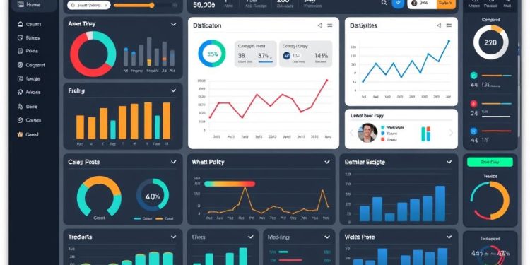
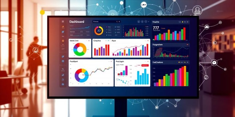
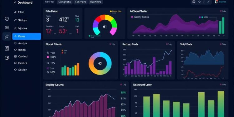
The transformation from static to interactive dashboards marks a significant trend in the realm of data visualization. As you delve deeper into today’s data-driven environment, you’ll discover how these interactive dashboards evolved from mere static visual aids into sophisticated and dynamic tools. These advancements not only enhance business intelligence but also *empower you* to make timely, data-driven decisions. With the global business intelligence market projected to surge from $23.1 billion in 2020 to $44.4 billion by 2026, the importance of these innovations cannot be understated.
Organizations harnessing the power of dynamic visualizations are reporting up to a 40% increase in user engagement. This trend points to a future where data analysis is not just faster, but also more enjoyable and accessible for everyone. As we navigate this transformative landscape, let’s explore how the rise of interactive dashboards is set to reshape the way you interpret and act on data.
The Evolution of Data Visualization
Understanding the evolution of data visualization allows you to appreciate how far we’ve come in our ability to represent data effectively. The data visualization history reveals a stunning journey that began with primitive methods and has transformed into sophisticated systems featuring interactivity, enhancing visual representation of data.
The Historical Roots of Data Representation
The journey of data visualization traces back to ancient times, when early humans employed cave paintings as a means of communication. Fast forward to the 17th century, when the creation of graphs and maps initiated a new era in data representation. By the 20th century, the development of static charts heralded significant advancements, employing colors and design principles to make complex information more digestible. The foundations established during these periods set the stage for understanding trends and insights that would come in later years.
Transformation from Static to Dynamic Visuals
The transition from static to dynamic visuals marks a pivotal shift in how data is explored and represented. The concept of dashboards originated in the 1960s with Decision Support Systems, but by the 1980s, they transformed into Business Intelligence systems capable of analyzing vast amounts of data. In the era of real-time information, you now witness data visualization tools that allow for immediate updates and insights. For instance, platforms like Tableau and Power BI enable dynamic visualizations that refresh with real-time data, significantly enhancing user engagement compared to earlier static dashboards. Companies such as Netflix and Verizon utilize interactive dashboards that provide immediate access to granular data, empowering decision-makers in various sectors.
Understanding Static Dashboards
Static dashboards serve as a fundamental tool in data visualization, providing a fixed representation of information. Often updated manually, these dashboards lack the real-time analysis that dynamic dashboards offer. They utilize traditional visual formats that may hinder engagement and responsiveness to evolving data conditions. Recognizing these characteristics and constraints can illuminate their place in contemporary business intelligence.
Characteristics and Limitations of Static Dashboards
Static dashboards present several distinct abilities and significant limitations:
- Fixed data representation, requiring manual updates.
- Limited to the perspective of a single user, which restricts insights to individual performance metrics.
- Often based on historical data, leading to a short shelf-life as they lack ongoing relevance.
- Require considerable time for manual data extraction from various sources, delaying decision-making.
- High risk of manual errors during data exporting due to extensive manual processes.
These data limitations ultimately impact the overall agility of your business intelligence efforts. Organizations find that static reporting often results in an incomplete view, which might not capture the comprehensive performance needed for strategic decision-making.
The Role of Static Reports in Business Intelligence
Despite their limitations, static reports retain a vital role in business intelligence. They deliver consistent overviews of key metrics and perform trend analysis, particularly valuable in environments where real-time data access is not essential. Common examples of static reports include:
| Type of Report | Purpose | Frequency |
|---|---|---|
| Daily Reports | Summarizes key data from the previous production day | Daily |
| Weekly Reports | Creates snapshots of performance to track progress | Weekly |
| Monthly Reports | Evaluates overall performance for strategy development | Monthly |
These static dashboards aid in creating a historical context for decision-making, helping organizations to archive reports after usage. While they may not provide the dynamic interactivity of modern tools, their historical significance in business intelligence remains relevant.
From Static to Dynamic Dashboards
The shift from static to dynamic dashboards has reshaped how organizations interact with their data. This evolution emphasizes the interactive dashboards significance, allowing users to explore and manipulate data in ways that were not possible before. Dynamic dashboards offer the capability to accommodate real-time data updates, ensuring that the metrics displayed are both current and relevant, ultimately improving decision-making processes.
The Significance of Interactivity in Modern Dashboards
Interactivity plays a crucial role in modern dashboards. Users now have the ability to click on charts, apply filters, and customize their views according to specific needs. This customizability enhances the relevance of the information presented, tailored to different teams or individuals within an organization. Moreover, the sharing capabilities of dynamic dashboards foster collaboration, creating a unified view among team members and stakeholders.
Transitioning from Basic Charts to Advanced Visualizations
Transitioning from basic charts to advanced visualizations marks a significant innovation in data representation. Dynamic dashboards utilize various components like tables, gauges, and sophisticated visuals that enhance data comprehension. This transition not only allows for better data storytelling but also ensures that key metrics, such as sales revenue and customer satisfaction scores, remain the foundation for strategic decision-making. By incorporating features like real-time synchronization with tools such as Coefficient, organizations can eliminate report limitations and maintain accurate, up-to-date data across platforms.
Key Features of Interactive Dashboards
Interactive dashboards come packed with essential capabilities that transform data analysis into a more engaging and effective experience. These key features allow you to make informed decisions swiftly and efficiently.
Real-Time Updates for Improved Decision-Making
One of the most significant advantages of interactive dashboards is their ability to provide real-time updates. This dynamic nature speeds up the decision-making process across various industries. With interactive dashboards, accessing vital reports shifts from taking hours or days to providing immediate insights. The capacity to facilitate real-time collaboration enables teams to stay aligned and agile, essential in today’s fast-paced business world. Research shows that 53% of organizations employing these dashboards experience enhanced decision-making processes due to the instant availability of information.
User Customization and Personalization
User customization stands as a cornerstone in the design of modern interactive dashboards. With numerous adjustable options available, you can tailor dashboards to fit your preferences and needs, ensuring that the experience resonates with individual users. Many users prefer customizable dynamic dashboards, indicating a strong demand for personalization in data visualization. Features like drill-down capabilities and filtering allow for deeper exploration of complex datasets, making data analysis intuitive and user-friendly.
Integration of Visualization Tools
Seamless integration of advanced visualization tools maximizes the functionality of interactive dashboards. These tools support features such as zooming, overlays, and video content, enhancing user engagement and promoting deeper insights. As dynamic dashboards evolve, they enable the tracking of financial metrics and performance indicators from various perspectives, ensuring comprehensive analysis. Companies leveraging AI-powered analytics report faster identification of key insights, further solidifying the importance of integrating modern visualization techniques.
Dashboard Trends Shaping the Future
With the rise of interactive dashboards, organizations are witnessing transformative dashboard trends that prioritize audience engagement and personalized experiences. The capabilities of AI and machine learning are playing a pivotal role in enhancing these dashboards, enabling a more insightful analytical journey. These advancements not only streamline data interaction but also empower users to make informed decisions swiftly.
Rising Importance of Audience Engagement
Engaging your audience is critical in the evolving landscape of dashboard design. Interactive dashboards foster a direct relationship with data, leading to improved decision-making processes. Users often report that frequent engagement with interactive features greatly enhances the usefulness of the data presented. This autonomy effectively reduces the number of additional report requests, allowing creators to focus on strategic insights rather than repetitive tasks.
- Cross-filtering capabilities by default improve the user experience.
- Dependent filters guide users towards contextually relevant data, uplifting satisfaction.
- The drill-down feature maintains a clean interface while providing detailed insights.
Future Technologies: AI and Machine Learning Integration
The integration of AI and machine learning into dashboards marks a significant leap towards future-ready analytics. Advanced analytics allow organizations to extract actionable insights, directly impacting decision-making speed. For instance, companies utilizing these technologies have experienced improvements in forecast accuracy and reductions in analysis time, showcasing their growing influence on organizational productivity.
| Technology | Impact on Decision-Making | Statistical Improvement |
|---|---|---|
| AI Algorithms | Sales Forecast Accuracy | 30% |
| Machine Learning | Analysis Time Reduction | 40% |
| Augmented Reality | Decision-Making Speed and Accuracy | 30% |
As organizations embrace these dashboard trends, real-time data access becomes crucial. Integration of multiple data sources, live data connections, and user-centered designs facilitate a holistic approach to data visualization, ensuring that decision-makers can rely on the dashboards for timely and accurate insights.
Challenges in Implementing Dynamic Dashboards
Dynamic dashboards offer remarkable improvements in data visualization and decision-making capabilities. Despite their benefits, you may encounter several challenges in implementation that can obstruct their full potential. Understanding these challenges is crucial for leveraging the advantages of dynamic dashboards effectively.
Overcoming Adoption Issues and Training Needs
One of the primary hurdles you might face is user resistance, which can arise from a lack of familiarity with new technologies. Addressing these training needs is essential to promote effective utilization. Research shows that tailored training programs can enhance user engagement by up to 30%, encouraging staff to embrace dynamic tools rather than resist them. Without focusing on adoption strategies, you could struggle with low engagement levels, which would compromise the dashboard’s effectiveness.
Ensuring Data Quality and Consistency
A critical aspect of dynamic dashboards is the accuracy of the data being displayed. A staggering 48% of businesses experience data integration issues during implementation. This can lead to inconsistent data, ultimately undermining the dashboard’s reliability. Focusing on data quality is imperative for success. Organizations must develop robust strategies that ensure all data is clean, relevant, and consistently updated. When users can trust the data they see, you’ll notice a substantial increase in the speed of decision-making, benefiting overall performance.
Conclusion
The rise of interactive dashboards has transformed the landscape of data visualization, empowering organizations with the ability to derive data-driven insights in real-time. Unlike traditional static reports, which provide a snapshot of information at a specific point in time, interactive dashboards allow for continuous updates and enhanced user engagement through features like drill-down capabilities and customizable filters. This shift is fundamental for businesses aiming to optimize efficiency and make informed decisions quickly.
As we delve further into the digital age, the future of business intelligence lies in harnessing these dynamic tools. The blend of real-time analytics and user personalization not only fosters a deeper understanding of metrics but also offers a competitive advantage in rapidly changing markets. By embracing interactive dashboards, your organization can adapt strategies instantly based on a steady flow of relevant data, ensuring you remain ahead of the curve.
Ultimately, adopting interactive dashboards paves the way for more innovative decision-making processes. With their ability to manage large, complex datasets while ensuring enhanced data security, they represent the best of both worlds—combining the simplicity of static reports with the dynamism required for modern business challenges. Leveraging these tools will undeniably set the stage for a more agile and informed approach to business intelligence in the future.


