
In today’s data-driven world, effective dashboard design is essential for businesses aiming to visualize critical metrics that drive informed decision-making. However, many designers encounter common design mistakes that hinder the potential of their dashboards. By understanding these dashboard pitfalls, you can create dashboards that enhance user experience and actively promote business performance. With the overwhelming number of data streams and visualization options available today, it’s imperative that you steer clear of these frequent missteps. This section will highlight key areas to consider, ensuring your dashboards are not only visually appealing but also informative and effective in conveying essential information.
Importance of Effective Dashboard Design
Effective dashboard design holds immense significance in the modern business landscape. A well-structured dashboard consolidates essential information, allowing users to access insights swiftly and efficiently. Focusing on user needs is crucial, as each stakeholder may require different data granularity to make informed decisions. By prioritizing these aspects, organizations foster an environment where clear communication and swift comprehension become standard practices.
Understanding User Needs
To create an effective dashboard, understanding user needs is imperative. Each role brings a unique perspective on which metrics hold the most value. For instance, an ad platform optimizer may prioritize CPM (cost per mille) metrics, while a VP of Marketing might focus on broader trends. Aligning dashboard design with these varying user expectations contributes significantly to enhancing overall business performance.
The Role of Clear Communication
Clear communication remains key in effective dashboard design. Users should grasp vital insights within five seconds of viewing the dashboard. Research in cognitive psychology suggests that the human brain efficiently comprehends approximately 7±2 visualizations. Thus, a design containing 5-9 visualizations prevents visual clutter and promotes ease of understanding. Following the inverted pyramid principle ensures crucial insights lead the display, providing clarity and focus.
Business Performance Monitoring
Monitoring business performance through an effective dashboard empowers organizations to gain real-time visibility into key metrics. Quick access to the ‘big picture’ allows rapid recognition of trends that influence strategic decisions. If dashboard designs are executed successfully, users can clearly identify their KPIs, facilitating timely adjustments to strategies. Emphasizing effective dashboard design ultimately enhances business intelligence capabilities, driving operational success.
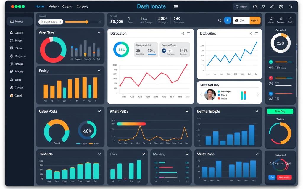
Common Dashboard Design Mistakes
A well-designed dashboard can transform data into actionable insights, yet numerous common mistakes impede its effectiveness. By understanding and addressing these pitfalls, you can create a clearer and more efficient user experience.
Poor Layout and Cluttered Visuals
A poor layout often leads to cluttered visuals that overwhelm users. When vital information is scattered throughout the dashboard without a cohesive structure, it becomes challenging for users to focus on meaningful insights. Studies indicate that keeping the number of visual elements between five and nine enhances engagement. Exceeding this optimal number can reduce the user’s ability to process information and may lead to disengagement. Reducing unnecessary decorative elements can also enhance clarity and improve the speed at which users can interpret data.
Lack of Clarity in Metrics
Clarity in metrics is essential for an informative dashboard. If users struggle to understand what each metric represents, they cannot make well-informed decisions. Well-defined metrics enhance user understanding and facilitate better decision-making. When visualizations lack context, up to 70% of users may misinterpret the data, leading to a ripple effect of poor conclusions. Aim for simplicity, ensuring that each metric clearly communicates its purpose to avoid confusion.
Overloading with Information
Information overload is a significant challenge in dashboard design. Users often feel overwhelmed when faced with numerous metrics, causing them to overlook critical information. Research shows that 70% of users experience anxiety when confronted with excessive details. To combat this, limit your dashboard to essential data that fits on a single screen, allowing for quick comprehension. Maintain an appropriate visual hierarchy to guide users to the key performance indicators without feeling swamped by too much information.
Dashboard Design: Best Practices to Consider
Implementing effective dashboard best practices can drastically enhance user experience and performance insights. Starting with clear goals establishes a defined purpose for the dashboard, guiding the selection of relevant metrics that truly matter. Ensuring the design is tailored to your audience promotes engaging and useful interactions. Effective white space utilization enhances visual clarity, allowing users to concentrate on critical information.
Setting Clear Goals for Your Dashboard
Defining clear goals is essential for a successful dashboard. Without well-articulated objectives, your dashboard may become cluttered with irrelevant data. By specifying what information is most important, you can streamline the design and improve user satisfaction.
Tailoring to Your Audience
Audience tailoring allows you to customize the dashboard experience. Understand who your users are and what they need. Recognize the distinctions between B2B and B2C services, as preferences for data visualization can differ significantly. Personalized dashboards resonate more effectively with users, increasing the likelihood they will engage with the data presented.
Utilizing White Space Wisely
Effective white space utilization is a key factor in minimizing visual clutter. A well-organized layout encourages users to focus on the essential elements without feeling overwhelmed. Avoid contributions of excessive white space but ensure that enough is present to enhance clarity and comprehension. The balance plays a critical role in making your dashboard more user-friendly.
| Best Practice | Description |
|---|---|
| Clear Goals | Define what metrics matter most to keep your dashboard focused and effective. |
| Audience Tailoring | Customize the dashboard experience based on user needs and preferences. |
| White Space Utilization | Use white space strategically to reduce clutter and highlight important information. |
How to Avoid Design Pitfalls
Avoiding design pitfalls in dashboard development is crucial for effective data presentation. Thoughtful choices in visualizations and color usage play a significant role in enhancing user experience and ensuring clarity in data interpretation.
Choosing the Right Visualizations
Selecting appropriate visualizations significantly impacts how your data is perceived. Different types of visualizations serve unique purposes. For instance, bar charts excel in comparing values, while line graphs illustrate trends over time. By understanding the data and the message you wish to convey, you can select visualizations that promote accuracy and prevent confusion. Sidestepping poor choices in this area helps in avoiding design pitfalls that compromise usability.
Maintaining Color Harmony
Color harmony is essential to ensure that your dashboard remains engaging without overwhelming users. Careful selection of a color palette enhances readability and avoids stark contrasts that may mislead viewers. Utilizing consistent color schemes allows users to quickly interpret information while keeping their focus where it matters most. Prioritizing color harmony not only improves aesthetics but also strengthens the overall impact of visualizations, leading to a more effective dashboard experience.
Conclusion
In summary, the significance of effective dashboard design cannot be overlooked. It serves as a vital tool in data communication, where the layout and clarity of metrics directly impact user engagement. By understanding design mistakes to avoid, such as cluttered visuals and information overload, you can create dashboards that truly serve their purpose. Research indicates that good design can enhance user interaction by up to 60%, illustrating the need for a thoughtful approach to dashboard creation.
Focusing on user needs and preferences can lead to significant benefits, such as a 30% improvement in user satisfaction when feedback is incorporated. Furthermore, employing clear visual hierarchies and consistent navigation patterns not only improves decision-making efficiency by as much as 70% but also enhances overall usability. When dashboards are tailored to meet user goals, users experience a 50% faster completion rate of data-driven tasks, showcasing how essential thoughtful design is in the decision-making process.
Ultimately, effective dashboards not only facilitate the easy access of critical data, but they also enhance productivity and engagement among users. By continuously iterating and seeking user input, businesses can create dashboards that are not only visually appealing but also incredibly functional, allowing for better data manipulation and overall performance monitoring. Remember, prioritizing user needs in both design and functionality will resonate with your audience, leading to a more efficient and enjoyable experience.


