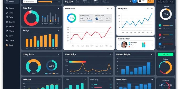
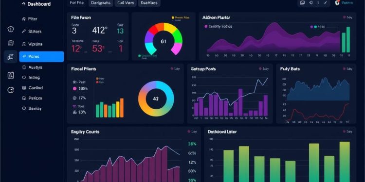
In an age where data is abundant, transforming that data into compelling narratives is crucial. Storytelling with dashboards offers an innovative approach to combine effective communication with striking dashboard design. By leveraging interactive analytics, you can elevate your data narrative, making complex information not just digestible but also engaging. This article will explore how integrating visuals with data storytelling can significantly impact user engagement and enhance decision-making processes. With proper narrative design and cognitive ease, dashboards become powerful tools that help convey essential insights clearly and effectively.
The Importance of Storytelling in Data Communication
Storytelling significantly enhances data communication by transforming complex information into relatable insights. This process, known as data storytelling, involves integrating quantitative metrics with visual designs to craft a cohesive narrative. Implementing narrative design in dashboards can captivate your audience and facilitate effective communication. Creating an engaging and clear storyline helps simplify challenging information, allowing users to better grasp the data presented.
Understanding Data Storytelling
Utilizing structured approaches, such as the “5W 1H” format in data analysis, you can effectively address key questions throughout your narrative. A review of data trends over the past three months helps establish performance consistency. In designing dashboards, consider a narrative flow that complements the reader’s preference for linear progression, similar to how one reads a book. The iterative process of crafting these dashboards leads to actionable insights, making practice essential for refinement.
Benefits of Effective Data Narratives
Incorporating storytelling techniques in data communication often yields positive stakeholder feedback regarding dashboard effectiveness. Many professionals mistakenly view dashboards as the sole solution for their data communication challenges. Instead, a focus on narrative-driven data input facilitates better decision-making. The right metrics selection is crucial; overloaded dashboards with too many metrics can overwhelm users. Utilize “hero metrics” for showcasing success and “villain metrics” to pinpoint areas needing improvement.
The relationship between narrative and dashboards is vital. A well-constructed dashboard provides clarity by guiding readers through the data story, enhancing audience engagement. Effective narratives influence stakeholders’ perceptions more significantly than mere visual enhancements. Workshops focusing on storytelling techniques are emerging to improve basic data visualization skills in various locations, starting with sessions in Austin on April 5th. These five-hour workshops promise individual attention and engagement, helping participants develop compelling data stories.
| Metric Type | Description | Impact |
|---|---|---|
| Hero Metrics | Indicates success and highlights key achievements | Boosts morale and showcases progress |
| Villain Metrics | Signals areas needing improvement | Encourages targeted action for better outcomes |
| Feedback from Stakeholders | Responses to narrative-driven dashboards | Increased understanding and engagement |
| Dashboard Clarity | Effectiveness in displaying key metrics | Improved decision-making processes |
Storytelling with Dashboards: Aligning Data, Design, and Purpose
Effective storytelling with dashboards involves more than just presenting data; it’s about integrating visuals that support compelling narratives. This integration not only enhances understanding but also fosters stronger user engagement. Selecting the right visual tools plays a critical role in dashboard design by helping to convey complex data points in an accessible manner.
Integrating Visuals to Support Data Narratives
Visual integration is essential for guiding users through the story your data tells. Various types of visuals, like line graphs and bar charts, serve different purposes. For example, line graphs excel in depicting trends over time, making them ideal for demonstrating patterns in performance monitoring. Using aligned visuals allows stakeholders to quickly grasp critical insights without extensive explanation, enhancing clarity and promoting informed decision-making.
Creating a Cohesive User Experience
A cohesive user experience ensures that dashboard elements work together harmoniously. When design principles focus on usability, you can create an interface that minimizes cognitive load and enables smoother navigation. Prioritizing simplicity by eliminating unnecessary elements, such as excessive colors or distracting gridlines, can dramatically improve dashboard clarity. You can also emphasize key metrics with color coding and clear terminology to make insights more impactful. This thoughtful approach to dashboard design can foster effective communication and engagement with the intended audience.
Key Elements of Effective Dashboard Design
Creating an effective dashboard requires attention to several fundamental elements that enhance both functionality and user satisfaction. By focusing on clear objectives, visual alignment, and dashboard usability, you can design a tool that not only communicates data effectively but also engages users meaningfully.
Defining Clear Objectives
Establishing clear objectives is crucial for any dashboard design. These clear objectives guide you in determining which data to feature prominently, ensuring that users can pay attention to the most relevant information. A well-structured approach enables focused storytelling, allowing insights to be uncovered quickly. Limiting the number of views typically enhances visual clarity and usability; ideally, dashboards should contain only two to three distinct views to avoid overwhelming users.
Choosing Aligned Visuals for User Engagement
The choice of visuals directly influences user engagement. Selecting aligned visuals that cater to the nature of the data can significantly improve comprehension. For instance, bar charts are effective for comparisons, line charts clearly communicate trends, and pie charts represent proportions well. Implementing cognitive psychology principles, which suggest that people process around 7±2 visual elements at once, indicates that your dashboard should incorporate no more than 5-9 visualizations. This strategy helps maintain user engagement and facilitates the comprehension of complex data sets.
Ensuring Dashboard Usability
Usability remains a top priority in dashboard design. Adopting a clean, minimalist design prevents cognitive overload while enhancing readability. Interactive elements, such as filters and drill-down options, allow users to adjust indicators without cluttering the visual space. Including context for each metric ensures that users can easily interpret the data, contributing to dashboard usability. A fixed layout template can simplify navigation, while employing whitespace effectively allows users to concentrate on the most important metrics. Regularly gathering user feedback on the dashboard interface will help refine its features, ensuring ongoing improvement.
Best Practices for Crafting Compelling Data Stories
Creating compelling data stories requires a strategic approach. You should prioritize actionable metrics and KPIs that resonate with your specific goals. By focusing on metrics that drive decision-making, you enhance the chances of inspiring action within your organization. Understanding how to effectively utilize these elements transforms your data into meaningful narratives.
Actionable Metrics and KPIs
Establishing actionable metrics and KPIs is essential for clarity in decision-making. Approximately 70% of employees feel more empowered when they comprehend data completely. By focusing on metrics that directly relate to performance goals, you foster an environment where data is respected and utilized for strategic planning. This ensures that everyone involved can draw actionable insights from the presented information.
Removing Clutter for Clarity
Removing clutter from your dashboards is vital for achieving clarity. A clean and well-structured dashboard eliminates distractions, allowing viewers to focus on the most critical insights. Effective data storytelling enhances information retention by up to 65%. Consider employing techniques such as consistent formatting and a limited color palette to help your audience navigate through essential data without overwhelming them with superfluous details.
Using the Right Tools for Data Analysis
Choosing appropriate data analysis tools streamlines the process of creating interactive dashboards. Platforms like Toucan empower users, regardless of technical expertise, to craft engaging visualizations. Companies that adopt data visualization tools report a 25% efficiency increase when interpreting data compared to traditional methods. These tools democratize data access and enhance user engagement, contributing to a data-driven culture where insights translate into informed actions.
| Practice | Description | Statistic |
|---|---|---|
| Actionable Metrics | Aligning metrics with performance goals to inspire action | 70% of employees feel empowered with data comprehension |
| Clutter Removal | Creating clean dashboards to enhance understanding | Improves information retention by up to 65% |
| Data Analysis Tools | Using tools to make data visualization accessible for users | 25% increase in efficiency when using visualization tools |
Conclusion
As we’ve explored throughout this article, storytelling with dashboards plays a crucial role in effective data communication. By aligning your data with purposeful design, you can craft engaging narratives that resonate with your audience. The principles discussed highlight the importance of focusing on actionable insights and relevant metrics, ensuring clarity and engagement in your data stories.
Utilizing tools like Toucan streamlines the data-gathering process, enabling you to create dashboards that present essential information with conciseness. By adhering to the recommended limit of 7 key performance indicators (KPIs) per dashboard, you can minimize cognitive load and foster a better understanding of complex data sets. Simplifying visuals and utilizing appropriate charts enhances your user’s decision-making capabilities while maintaining a clear focus on organizational goals.
Incorporating these strategies into your approach will not only enhance insights-driven decision-making within your organization but also promote a more informative and user-friendly data experience. Embrace the power of storytelling in your dashboards, and watch as your data narratives transform into effective communication tools that drive impactful results.


